ARTS REVELSTOKE BRANDING 2018
The digital hub for the arts in Revelstoke, British Columbia
In Revelstoke, there is the Revelstoke Art Gallery, the Revelstoke Arts Council and the Revelstoke Performing Arts Centre. They agreed by representing these organizations together, the Revelstoke arts community can better leverage their promotion, activities and membership base.
Challenge
Solution
Strange Ideas, through its branding process established Arts Revelstoke as a bold, colourful and dynamic living entity that all artistic disciplines can leverage and embody.
Firstly, Strange Ideas established a mission/value statement based on a questionnaire to the stakeholders...
Arts Revelstoke provides artistic experiences to open-minded and fun people in an exciting and inclusive way. Arts Revelstoke helps artists with organization and recognition to achieve a sense of belonging and opportunity. Arts Revelstoke is here to make a creative impact!
After the development of concepts, the brand identity was chosen by the stakeholders at the yearly AGM.
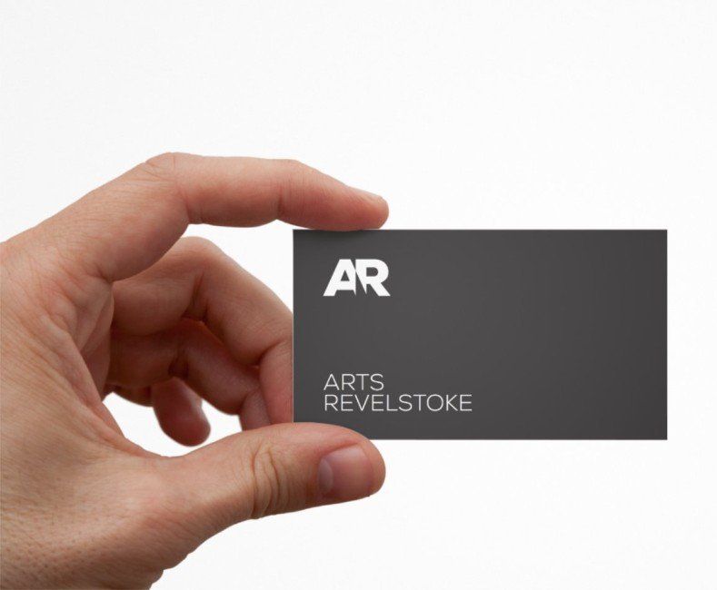
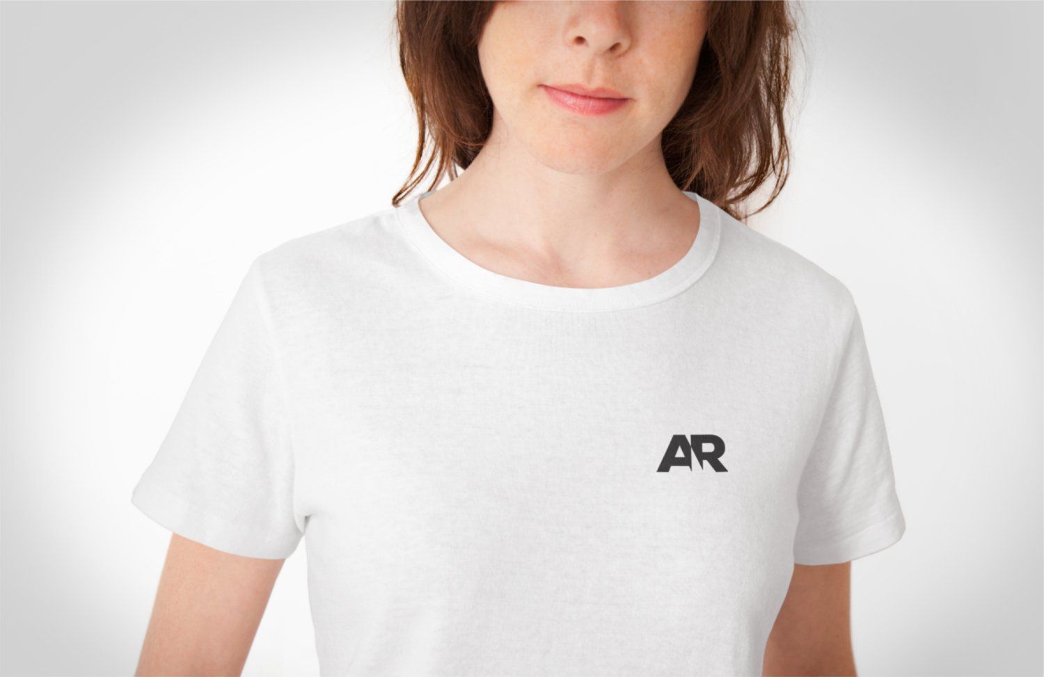
The chosen identity


Identity stylescape
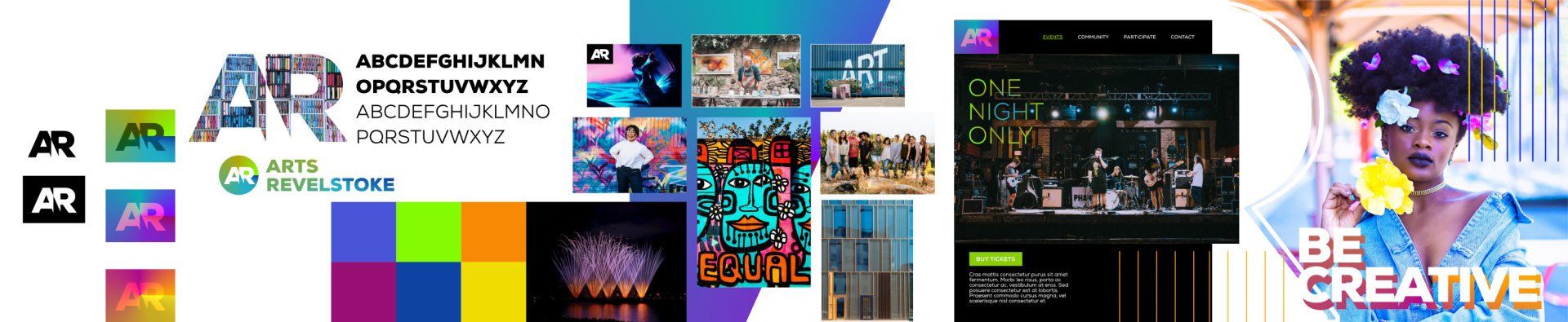
Identity variations
Style Guide
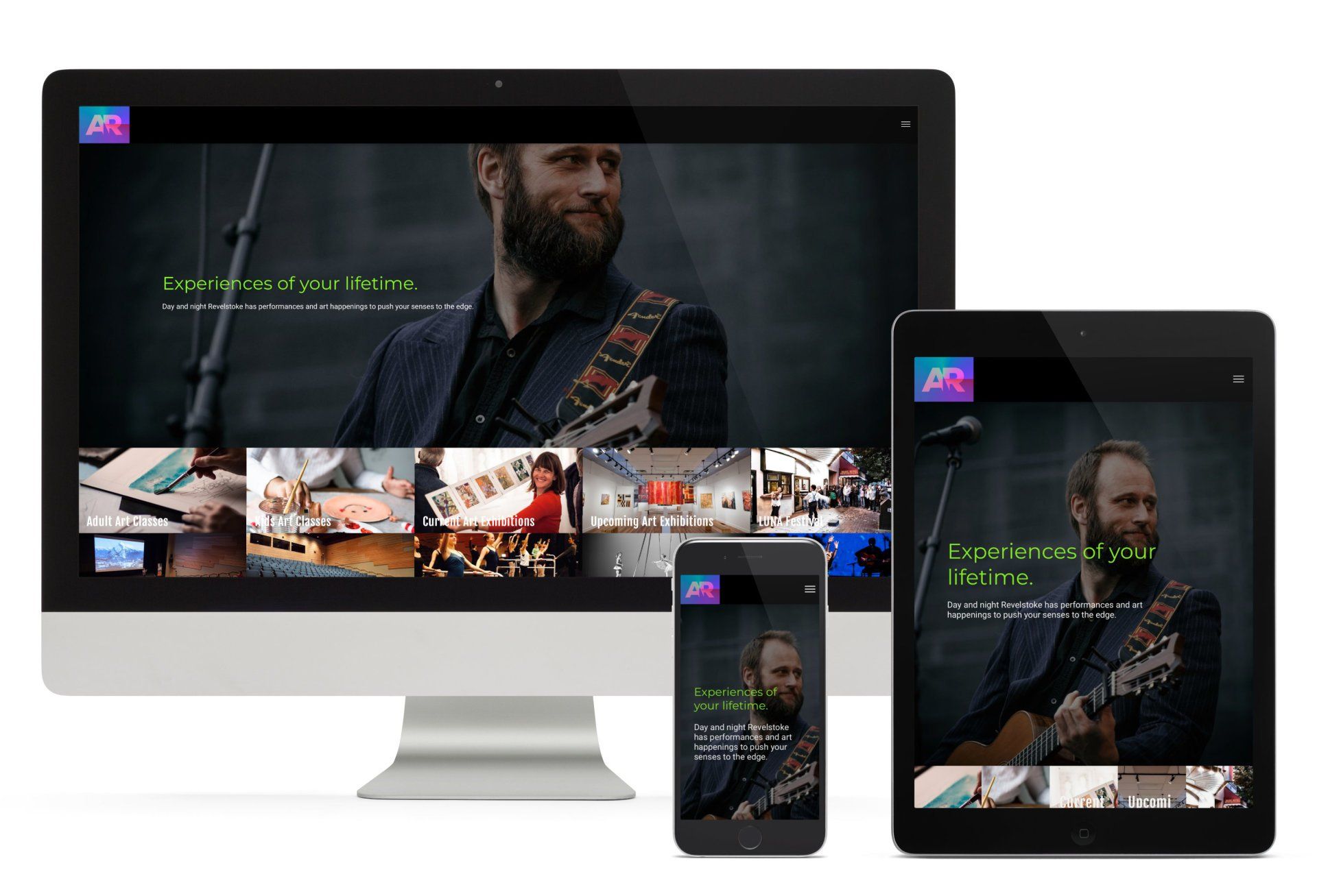
Website Development/UI Design